project
paper wordsmith
branding | ux/ui design | social media templates

info
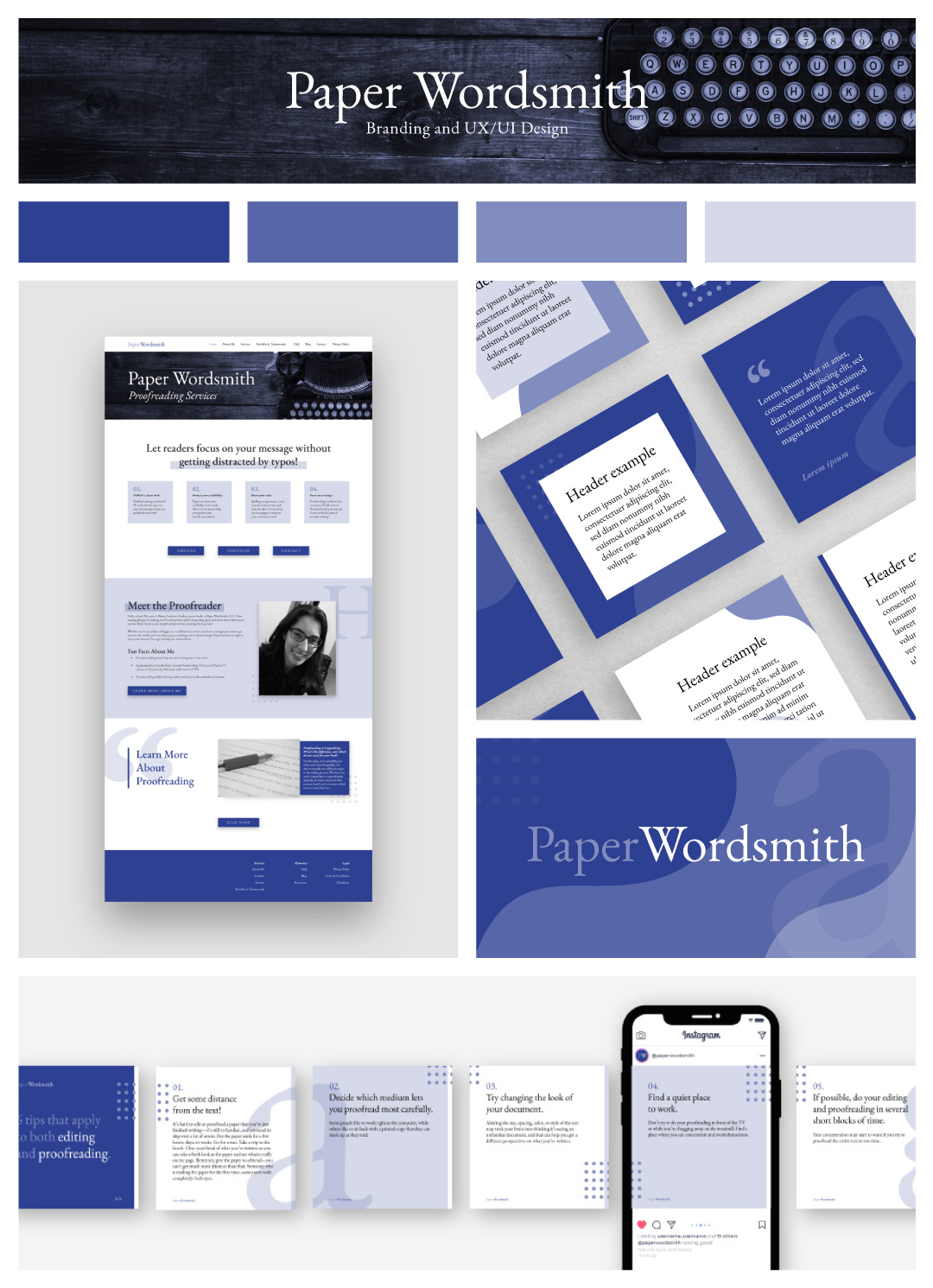
Paper Wordsmith is a company that offers proofreading services, as well as tips and tricks for writers. The company wanted a modern visual style that respected the history of book publishing, therefore we developed a style using a classic font that is easily found in most printed books, while using shades of purple with a subtle tint of blue to convey stability and portraying a trustworthy and clean image.
A few design motifs were added to the visual style, like enlarged letters of the used typeface, and symbols like quotation marks can be found throughout the designs, such as the website, and social media templates.
materials:
- branding
- color pallet
- style guide
- website [ux/ui]
- social media templates
