project
mercado sehat
menu design | layout

info
Mercado Sehat is a café that targets young audiences who have a special love for the craft.
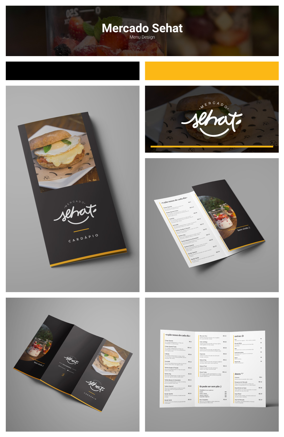
The objective of the menu design was to, first of all, organize and categorize the different items in a simple and clear manner.
The design needed to seem approachable while properly showcasing the delicious items they make from scratch, while targeting their desired audience.
Typed emojis were used as design motifs to contrast with the seriousness of the already established brand, making the design overall clean and welcoming for its loyal customers.
materials:
- branding
- color pallet
- menu layout
- editorial
